No estas registrado.
#1 10 May, 2011 10:09:37
Ce texte est pour l'instant uniquement en anglais.
Learn here how to prepare your files for a good printing. When working on a computer, most people don't think about the printing limitations, and here goes a big surprise when they want to actually print it! Parts of the pictures are cut, some text in balloons is cut too...
=== Know your layout ===
You'll have to work with a margin in mind. Several margins in fact. Here they are :
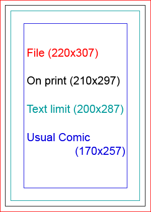
File (220x307)
This is your working document. Your Photoshop file if you use photoshop.On print (210x297)
This is what the reader will see on an actual comic. Printing cuts aren't perfect so we need to draw a little further. It's A4 (21cm X 29x7cm).Text limit (200x287)
Never draw too near the hedge. It can be lost, in the middle of the book, and it doesn't look nice.Usual Comic (170x257)
Here is where your basic layout will be.
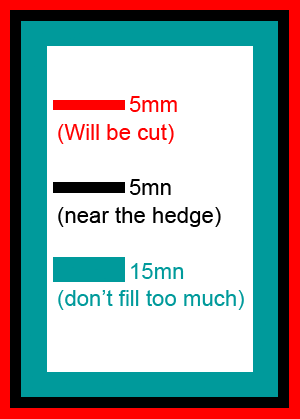
MA: Space that will be cut: 5mm wide
MB: Space that you must NOT put important things in (text, details in picture): 5mm wide
MC: Space that you should not draw too much in it: 15mm wide
When you work on the page, don't worry about all that "lost space" you'll see on your document. You may thing it would be nicer to make it bigger and use all the space, but it's a trap ! The computer don't show things the same was a paper does. Also, think about the cutting and the inside of the manga.
#2 10 May, 2011 10:18:44
=== How to create my basic file ? ===
Specification for the print (in amilova) are:
A4 (standard europeen comic)
400 dpi
RGB (not CMYK) or greyscale
First, let me answer your questions:
I don't want to do a A4 page! I'm doing a manga or a comic, there are much smaller!
Don't worry. Still work on the sizes we gave you, in millimeters, in A4 and all. We will make it work on print on the good size. You can work on a smaller DPI in that case. But don't go less than 250 dpi
My scanner didn't gave me 300 dpi! I'm gonna die!
First, you should learn to master a little your scanner if you want to be a professionnal. Second, We can work in 300 dpi, especially if you will print in smaller than A4. But it can look less good.
RGB? I was always told that printers needed CMYK.
Don't worry. In fact, what you see on your computer in RGB, is the nearest look you can have to paper. If you save in CMYK, the colors on your screen will change, and you will think it's not good. Don't try that. We will give the printer proper CMYK, but you should work in RGB.
I'm drawing in black and white...
Use "greyscales".
What about the little dots that makes a greyscale effect from black and white printing?
Don't do that! DON'T DO THAT!! Use Greyscale.
What size is it in pixels?
Listen, you're not drawing for the Game Boy. You're an artist. You're above pixels. Don't think in pixels. Only work in millimeters, with a specific DPI.
![]()
Ok, now, let's create a working file.
If you use Photoshop, you can download this file and use it a a template, or create yours like this :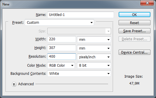
So the millimeters (mm) aren't the same as A4, it's bigger, because of the cutting margin.
Note: DPI = dot per inches = "pixels/inch". Do NOT use "pixels/cm", or else, kittens will die.
If you scanned your page, it's best to put it in the template page. If your scan is way bigger, resize it. If it's way smaller, scan it again in a higher definition.
Definitions to choose on your scanner, depending on what you draw on :
I also add the margins you can use (see first paragraph). Remember your sheet size is NOT the printing size.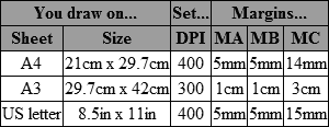
For people with an inch ruler:
5mm = 1.5 eighths of inches
15mm = 4.5 eighths of inches
#3 10 May, 2011 10:20:39
=== Examples of use ===
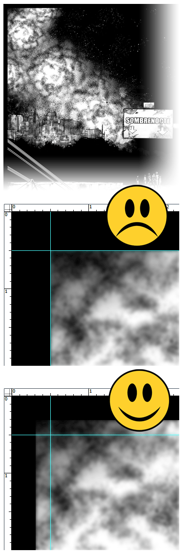
These images show the photoshop template, the blue lines are Guides and aren't either on the website nor the printing ![]()
Here is a simple case, we draw out of the usual comic space. It's ok as long as we don't touch the next Guide. 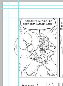
On this one, we want to draw until the end of the printing. So we need to draw further. But careful ! Nothing important must be drawn near the margins. 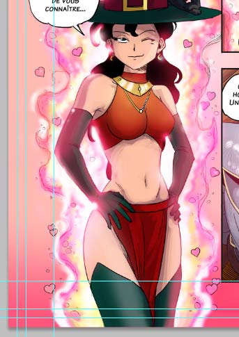
You may wonder "but look at all this lost space! I want to draw here! Don't kill trees in vain !
First, may I remind you that trees are dangerous and SHOULD be killed. Didn't you see the Two Towers? 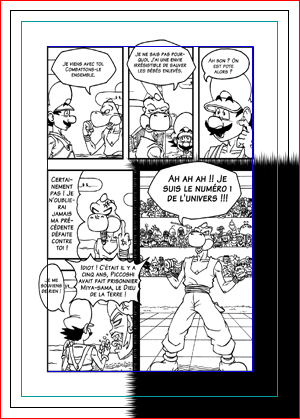
Second, here's how this space will be used. Adding a page number. Adding a title.
Publisher have all many ways to use that space. And plus, the it adds clarity. 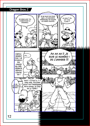
#5 30 Aug, 2011 11:36:03
Quand vous ajoutez une marge de découpe (5mm) à une votre BD...
Si vous avez un dessin qui touche le bord: vous devez dépasser la marge, pas la toucher.
N'oubliez pas que cette marge sera imprimée, puis le papier coupé.
S'il y a un décalage d'un demi millimètre sur la découpe, le lecteur verra une fine bande noire pas jolie.
Or c'est exactement ce qu'on veut éviter.
 CC BY-NC-ND 3.0
Últimos posts